 |
| Nikola Tesla |
 |
| Ms. Lardizabal |
 |
| Myself |
|
| Nikola Tesla |
|
| Ms. Lardizabal |
|
| Myself |

 But by making these double exposures, the class used photoshop. But even before you go onto photoshop you first have to get two or more photos of anything that pleases you. Then you load those photos into a stack along with your portrait. Then you use the dodge tool to start dodging your portrait. It is best that the background of the portrait is as white as possible. Once that is done, you can double click on your other images and use layer adjustments to make your double exposure to look like however you desire. After you have done all of those steps, hopefully you have made a unique double exposure! I think once you have made a double exposure you can see why you would want to make one. Making a double exposure is a great technique in photoshop, which is gaurunteed to give you great results. Plus you can make a double exposure photo that represents who you are!

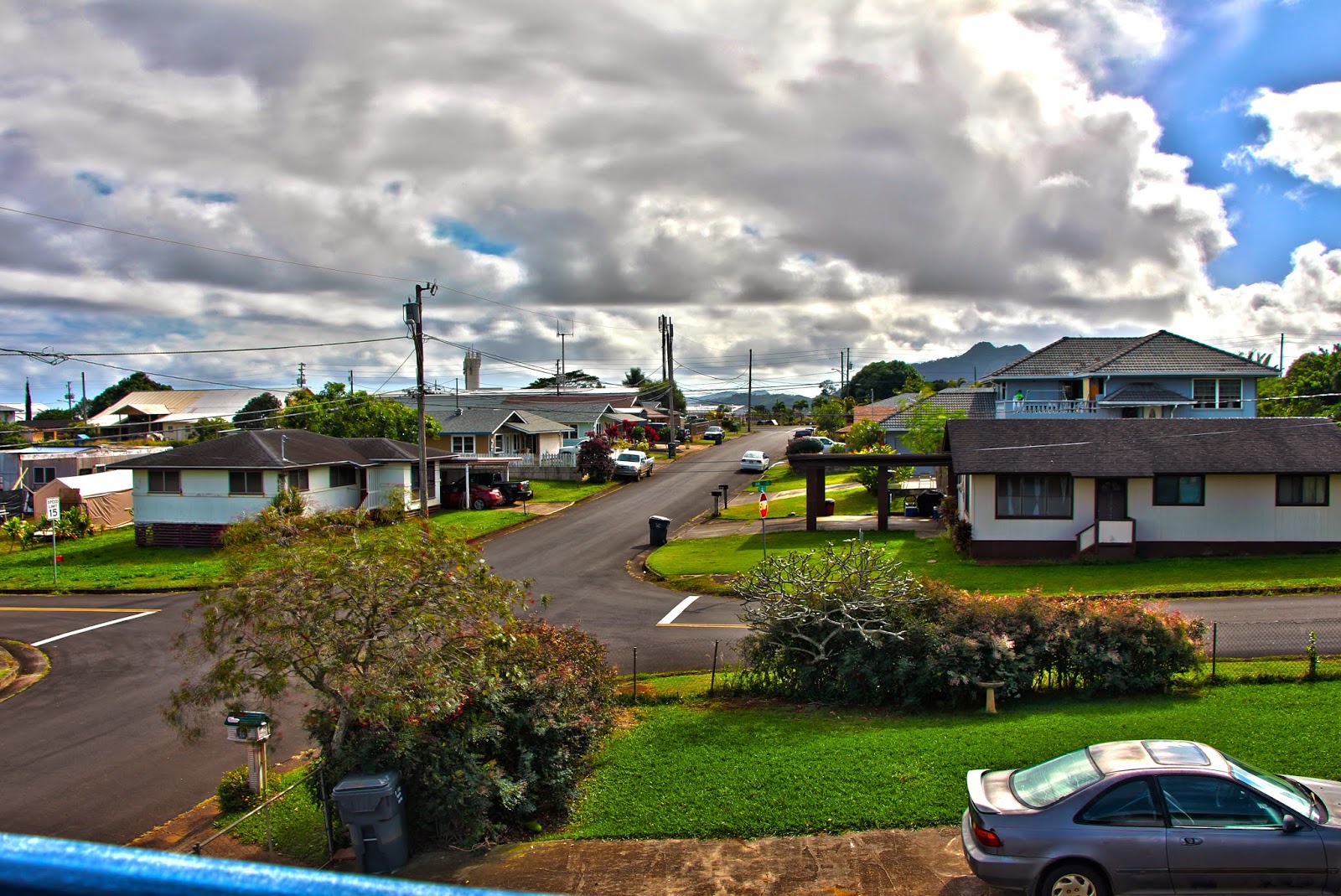 In order to make an HDR photo, you have to go through a couple of big steps. First things first, you need to take 3 or more photos of the same view with no movement. But in different exposures. You have to make sure that your horizontal line is straight, you have a good rule of thirds, and a good focal point. Once you have all the photos you need, you put them on photoshop in HDR Pro mode. Photoshop will then combine all of your photos into one photo where you can see the darkest parts of the view and the lightest parts of the view clearly, the whole photo will be in balanced lighting. Once Photoshop is done with that, the next part is all up to you. With the photo you have, it's your choice to put as many effects as you want. You can make it realistic, surrealistic, leave it as it is, or ect. Once you have done all of those steps, you are done. Hopefully you'll now have an amazing HDR photo! This process is different than other automatic HDR functions, e.p. your cell phone, because with this process you can add as many different effects as you want. While on an automatic HDR function you don't really get a choice on how much effects you want to add to you photo.
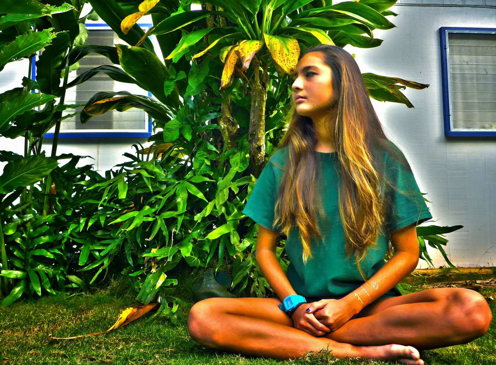 My first HDR photo is a landscape photo that I took on a deck at my friend's house. I think for this photo I have a really good focal point but I could've put more thought into my rule of thirds. My horizontal line seems to be in the dead center of the photo, when it should've been a little higher or a little higher. I also added some effects to make it look surrealistic. I think it looks quite dramatic! My second HDR photo is a portait of my friend, Gabby Duran. It took quite a while to take this one, considering she had to stay in that position for about 2 minutes. I think my rule of thirds is perfect! But I think I could've made her turn her head a little more to the camera. I also added effects to make it surrealistic as well. I think it came out beautiful! My last HDR photo is a superimpost photo, where I combined both of my HDR photos into one photo. I cut out my friend out of the portrait and placed onto my HDR landscape photo. I also added some effects so the cutout looks smooth. Once I did that I added a word that is surrealistic and relates to what the photo is telling the audience. I put the word "imagine" and added effects so that it looks more eye catching. I think that photo came out beautiful, I wouldn't change a thing!
 The latest project that Mr.Sanderl that assigned the G.T. class was to make a movie trailer that was appropriate enough for elementary students. My teammates were Miles Frazier, Lilio masi, and Ehu Keala. Mostly everyone in that G.T. class wrote stories for a project for their English class. So somebody's story from each team would have to be made into a movie trailer. My team and I decided to do a movie trailer on Lilio's story, Young and Brokenhearted. The main characters were Ziggy Twisty played by Miles Frazier and Malia Hessenheffer played by ... me! Before we started filming, we made a trailer plan. So that we mainly plan everything that would be put in the movie trailer and not get stuck on what to do next. I contributed into this project by playing a roll as Malia Hessenheffer and I helped out on the trailer plan.
 The title of my movie poster, "Young and Broken Hearted", practically tells you what the movie is about. Ziggy is a young freshman and goes through a very tough first year of high school. But then he meets a very special someone, but it all takes a turn on him. Now he is broken hearted. So that is mainly why my team and I chose to title our movie that we are making "Young and Broken Hearted". In my movie poster I used a lot of effect and one of the most important one is kerning. Kerning is the process of adjusting the space between letters. Kerning is very useful when editing your title for a movie poster because it makes your title more appealing and makes your title stand out.
 To be honest I am a procrastinator, sadly. I'm not really proud of it, but I seem to be able to manage my GPA to be at an average of 3.66. I am a procrastinator because I seem to always do most of my homework and projects at the last minute. I get distracted very easily by social media, games, and TV. But I seem to always turn in my work the next day on time.
